

Your website looks modern, but your sales say otherwise.
You invested in a sleek redesign. The gradients are tasteful, the animations glide, the typography whispers premium. But the pipeline? Quiet. If that sounds familiar, you do not have a design problem — you have a conversion system problem.
The gap between pretty and profitable
High-gloss visuals are table stakes. They build trust, but they do not create demand by themselves. Sales come from clarity, frictionless paths, proof, and follow-up. Most modern sites fail because they treat the homepage like a poster, not a system.
Common symptoms founders report:
- Traffic is healthy, but demo requests are flat.
- Users click around, then vanish. No follow-up. No nurture.
- Contact forms send emails to a shared inbox that no one owns.
- The offer is vague; CTAs are diluted across five choices.
- No instrumentation: you cannot see where people drop off or which channels pay back.
A conversion-first website looks different
A high-performing site is a machine with four connected parts:
- Message-market clarity: a headline that says who you help, what you solve, and the outcome. Example: 'Automate your onboarding. Cut admin by 70% in 30 days.'
- Single, obvious next step: one primary CTA repeated consistently. Book a call, start a trial, get a pricing estimate.
- Evidence payload: quantified outcomes, case studies, logos, and short proof points near every decision moment.
- Automation and measurement: every form, click, and key action triggers routing, scoring, follow-up, and reporting.
Example: from nice to needle-moving
A B2B services firm came to us with a fine-looking site: abstract 3D shapes, clever copy, a carousel of services. Conversions hovered at 0.5%.
We rebuilt the system:
- Rewrote the hero to a clear, outcome-led statement and removed two competing CTAs.
- Added a 60-second explainer video and a calculator that quantifies savings.
- Moved social proof above the fold and added results callouts near the CTA.
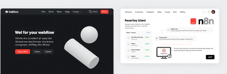
- Set up N8n flows to push form data into the CRM, score leads, auto-qualify with a 3-question step, and trigger instant calendar links for A-grade leads.
- Instrumented events in Webflow, piping to analytics for a weekly revenue attribution report.
Result: demo conversion rose to 2.3% in 45 days, sales cycle shortened by a week, and the team reclaimed hours previously lost to manual triage.
The conversion checklist for founders
- Clarity beats clever: could a stranger repeat your value proposition after five seconds?
- One primary path: do not make visitors choose between six CTAs.
- Friction with purpose: short form upfront, deeper questions after commitment.
- Proof density: every scroll should encounter outcomes, not adjectives.
- Speed and stability: sub-2s load, no layout jank, no broken animations.
- Follow-up by design: instant confirmation, calendar booking, and a nurture sequence for those not ready yet.
- Attribution you trust: know which pages and campaigns actually produce revenue.
Design is the skin. Automation is the nervous system.
Without automation, leads leak. With N8n, your website becomes operationally sharp:
- Lead capture to CRM within seconds, with data enrichment and source tagging.
- Auto-qualification: route A, B, C leads differently. A gets a calendar link and a Slack alert to sales. B enters a 5-day case study sequence. C receives a helpful resource and checks back in 30 days.
- Deal hygiene: if a lead stalls, trigger reminders, a nudge email, or a meeting reschedule prompt.
- Closed-loop reporting: pull won revenue back into analytics to see which pages and channels actually paid.
This is how you stop guessing and start compounding.
The WeCraft way
We build better systems — both online and operationally. Our approach pairs modern Webflow design with N8n automation to turn websites into sales infrastructure.
- Discovery and conversion mapping: align offers, ICPs, and the primary journey.
- Message and UX sprints: sharp copy, decisive paths, minimal friction.
- Proof and performance: case studies, calculators, and speed as a feature.
- Automation layer: CRM integration, lead scoring, routing, nurture, and alerts.
- Instrumentation: event tracking and weekly insights that guide iteration.
If your site is pretty but quiet, the problem is not the pixels. It is the missing system behind them. WeCraft Studio designs for trust and builds for throughput — so the next redesign is the last one you need for a long while.
Insights That Sparkle
Stay inspired with fresh ideas, industry tips, and behind-the-scenes stories. Our blog is where we share trends, knowledge, and a touch of creativity to help you grow, glow, and stay ahead.
%20(1).png)

.png)
.png)
.png)
%20(1).png)