


Stop tweaking ad spend — your site is the conversion choke point
If you're constantly nudging budgets, swapping headlines, and chasing cheaper clicks, here's the uncomfortable truth: the ad platform isn't the problem. Your website is the choke point.
Founders tell us, “We doubled spend and leads barely moved.” When we look under the hood, the story is the same: beautiful site, poor conversion system. Aesthetic polish without performance discipline is how marketing dollars evaporate.
Pretty isn’t persuasive
Design matters. But design that wins awards is not the same as design that wins customers. A striking hero with abstract copy like “We transform experiences” feels premium. It also asks your visitor to do the work of understanding you. People don’t. They bounce.
Performance design is blunt: it states the outcome, shows proof, and makes the next step obvious. It removes decision debt. It respects time. It turns curiosity into commitment.
Where conversions die (and how to fix them)
- Message match: Ad promises “Cut invoice time by 60%.” Landing page opens with “Innovating the future of finance.” That mismatch shatters momentum. Fix: mirror the ad’s promise and language above the fold.
- Clarity over clever: Lead with what you do, for whom, and the payoff. One line, one CTA. Save the brand poetry for later.
- Speed and mobile: If your Time to Interactive drags, your CAC swells. Every 0.5s delay costs conversions. Optimize Webflow assets, lazy-load, and keep scripts lean.
- Form friction: Twelve fields, multi-step, no autofill — you’re training prospects to abandon. Ask for the minimum. Add progress, inline validation, and a calendar drop-in to book instantly.
- Proof density: Logos, quantified outcomes, case snippets near CTAs. Proof isn’t a separate page; it’s on the path to action.
- Navigation leaks: Mega-menus turn landing pages into sightseeing tours. On campaign pages, control exits and route visitors to one outcome.
- Pricing ambiguity: If your plans, inclusions, or next steps are unclear, people assume it’s expensive or risky. Use comparison tables, FAQs, and a low-friction CTA (try, demo, pilot).
- Follow-up void: No thank-you page logic, no UTM capture, no instant response. Interest decays in minutes. Automate it.
A quick example
A B2B SaaS founder pushed ad spend from $12k to $30k/month. Results: CPC dropped 9%, but qualified demos rose by just 4%. On-site reality: 71% mobile traffic, 4.8s TTI on mobile, 11-field demo form, no calendar on submit, no Slack alerts for new leads, and no UTM continuity into the CRM. Sales took 7 hours to reply. The funnel didn’t need cheaper clicks; it needed a working system.
Conversion is a system, not a page
High-performing sites are front-end clarity plus back-end rigor. The page pulls; the ops catch.
The WeCraft way
- Focused architectures: Campaign-specific Webflow landing pages with exact message match, modular blocks for rapid iteration, and ruthless prioritization above the fold.
- Speed by design: Optimized assets, clean CSS, minimal JS, accessibility and structured data baked in. Core Web Vitals monitored, not hoped for.
- Clear paths to action: Primary CTA plus smart micro-conversions (save a quote, send to email, watch 2-min demo) to capture intent earlier.
- Proof where it matters: Outcome-driven case studies and numbers at decision points — not buried in a menu.
- Measurement that actually measures: GA4 events, server-side tagging when needed, pixel hygiene, and UTM carry-through into the CRM so revenue can be attributed, not guessed.
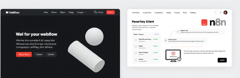
- Automation with n8n: When a form is submitted, we enrich (e.g., company size, industry), score, and route the lead; create a CRM record; trigger Slack alerts with context; book directly to Calendly if qualified; drop unqualified into a nurture; and send a personal-feeling email within minutes. If a form’s abandoned, we trigger a gentle reminder. If a mailbox bounces, we branch. No manual swivel-chair work.
- Speed-to-lead by default: Under 2 minutes from submit to human touch — one of the simplest, highest-ROI changes you can make.
- Experimentation cadence: Hypothesis-driven A/B tests (headline, offer, form length), weekly reviews, and changes shipped without breaking the design system.
What changes when the choke point clears
- Same ad spend, 20–50% more qualified pipeline.
- Lower CAC because fewer paid clicks are wasted.
- Higher demo-show rates through instant scheduling and reminders.
- Shorter sales cycles thanks to pre-sold, proof-rich pages.
- Confidence to scale because attribution finally tells you what’s working.
If this sounds familiar
You don’t need another bidding strategy. You need a site that converts and operations that respond at the speed of interest.
WeCraft Studio builds better systems — online and operationally. Modern, fast Webflow sites paired with n8n automations that catch every lead, route it, and follow up instantly. The result: fewer leaks, more revenue, and a marketing engine you can finally scale.
If you want an honest audit and a plan to fix the choke point, we’re ready.
Insights That Sparkle
Stay inspired with fresh ideas, industry tips, and behind-the-scenes stories. Our blog is where we share trends, knowledge, and a touch of creativity to help you grow, glow, and stay ahead.
%20(1).png)

.png)
.png)
.png)
%20(1).png)