


What nobody tells you about redesigns: speed, clarity, and fewer meetings
Founders expect a redesign to fix everything: better brand, better conversions, less chaos. Then the new site launches, and the metrics barely move. Sales is still chasing leads. Marketing is still guessing. Your calendar is still full of alignment calls.
The problem isn’t design. It’s that most redesigns stop at aesthetics. What actually drives pipeline is a system: speed that protects intent, clarity that reduces decisions, and automation that removes meetings.
A beautiful site without a conversion system is expensive art
Your website is a sales process, not a portfolio. If pages look slick but there’s no structured path to a booked call or a trial, you’ve just polished the brochure. Common failure patterns:
- Hero videos and heavy animations that slow the first impression.
- Copy that talks about innovation instead of stating the outcome you deliver.
- Forms that send to a generic inbox, with no routing, no SLA, no follow-up.
- One CTA for everyone, regardless of where they are in the buying journey.
Result: paid traffic gets more expensive, organic traffic bounces, and your team fills the gap with meetings.
Speed: the silent conversion lever
Speed protects intent. When someone is curious, seconds decide whether they stay long enough to act. Faster sites also rank and convert better because they reduce friction from the first interaction.
What this looks like in practice on Webflow:
- Lightweight components and purposeful interactions instead of heavy libraries.
- Optimized media: modern image formats, compressed assets, lazy loading, and avoiding autoplay video in the hero.
- Clean structure: fewer render-blocking scripts, smart preloading of critical assets, and native features over hacks.
Business impact: more visitors see your value prop, more reach your CTA, and more complete forms. You don’t need a bigger ad budget to book more qualified calls.
Clarity: say less, convert more
Clarity reduces cognitive load. A converting page answers three questions immediately: what you do, who it’s for, and the outcome. Then it shows proof and gives a single, obvious next step.
Elements that consistently lift performance:
- A plainspoken headline tied to a measurable result. Example: Automate invoice approvals in days, not months.
- One primary CTA, repeated. Book a demo or Get pricing should be visible without scrolling.
- Segment-specific pages that mirror intent: founder, ops lead, or finance each sees their outcome and proof.
- Short forms with progressive steps. Ask what matters: timeline, use case, budget range.
- Pricing context, even if exact prices are custom. Anchors reduce qualification calls.
- Proof close to action: logos, short testimonials, a 60-second walkthrough.
Clarity converts because it respects time. Visitors shouldn’t need a meeting to understand you.
Fewer meetings: design a self-serve buying journey
Most teams meet because the website and tooling aren’t doing their job. Fix the system, and meetings disappear.
What fewer meetings looks like with smart automation:
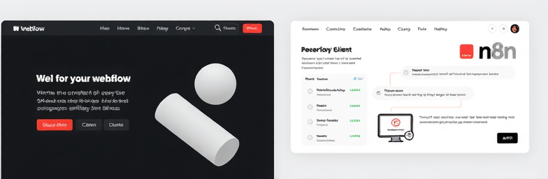
- Lead routing in n8n: when a form is submitted, enrich the company, score the lead, route to the right owner, and create a CRM deal automatically.
- Instant scheduling: calendar routing based on segment or region, with a pre-read sent automatically.
- Self-qualification: a concise intake that filters misfits early and fast-tracks ideal buyers.
- Operational visibility: a Slack summary with context (industry, size, intent) so the first call starts at strategy, not discovery.
The outcome is not just speed to lead; it’s fewer low-value calls. Your team focuses on decisions, not status updates.
Build a conversion system, not just pages
A high-performing website connects four loops:
- Traffic quality: map campaigns to specific, intent-matched landing pages.
- On-page performance: fast loads, focused narratives, and frictionless CTAs.
- Automation: lead capture to CRM to calendar to follow-up, no manual steps.
- Measurement: clean analytics events (cta_click, form_submit, calendar_booked), dashboards that show which stories and channels win.
When these loops are in place, growth is iterative: you test messages, speed up pages, refine forms, and watch the pipeline move.
The WeCraft way
At WeCraft Studio, we build modern, high-performing Webflow sites and wire the operational backbone with n8n. That means:
- Speed by default: component libraries tuned for performance and Core Web Vitals.
- Clarity by design: crisp narratives, intent-specific pages, and frictionless CTAs.
- Fewer meetings through automation: lead routing, enrichment, scheduling, and clean analytics—set once, running always.
A redesign should deliver more than a prettier homepage. It should feel like this: faster pages, sharper messaging, cleaner dashboards, and a calmer calendar.
If that’s the upgrade you’re after—modern design plus smart automation with tangible business impact—let’s build the system that converts.
Insights That Sparkle
Stay inspired with fresh ideas, industry tips, and behind-the-scenes stories. Our blog is where we share trends, knowledge, and a touch of creativity to help you grow, glow, and stay ahead.
%20(1).png)

.png)
.png)
.png)
%20(1).png)