


You don’t need more traffic — you need fewer dead ends.
Most founders come to us asking for more traffic. Ads, SEO, social. But when we look under the hood, the real problem is simpler: visitors have nowhere obvious to go. Your funnel isn’t leaking — it’s blocked by dead ends. A beautiful homepage, clever copy, and a shiny portfolio won’t save a visitor who can’t see a next step or gets lost in clicks.
Traffic is expensive. Dead ends are silent. Remove them, and your current traffic performs like you just doubled it — without spending a dime more on acquisition.
A pretty website isn’t a performing website
Design matters. It earns trust in seconds. But after trust comes direction. Performance design answers two questions immediately: What is this for? What should I do next? If your hero makes me think but your page doesn’t show me the next move, I’ll bounce.
Aesthetic-only sites optimize for applause — not action. Performance sites optimize for outcomes: booked calls, qualified demos, trial signups, downloads that trigger intelligent follow-up. The difference is a system, not a style.
Where dead ends hide (and cost you)
- Vague hero sections: Beautiful headline. Zero clarity. No primary call-to-action above the fold.
- Navigation as a junk drawer: 9+ menu items, no hierarchy. Users wander. Nobody converts.
- Blog posts with no next step: Great content that ends with “Thanks for reading.” No lead magnet, no related offer, no subscribe.
- Pricing pages that stall: No side-by-side comparison, no CTA in view, no help for different buyer types.
- Forms that go to a black hole: No auto-confirmation, no immediate scheduling, no follow-up workflow. Prospects go cold.
- Case studies without context: Nice story, but no CTA, no industry filter, no proof near the action.
- Dead 404 and thank-you pages: Pages end the session instead of routing users to the next best step.
Each dead end depresses conversion rate. If 5,000 people visit monthly and 0.6% convert, you get 30 leads. Eliminate friction and lift to 1.2%, and you’ve doubled pipeline — with the same traffic.
What actually makes a website convert
- One primary goal per page: Every page exists to move the visitor one step. Secondary CTAs live lower, not shoulder-to-shoulder.
- Contextual proof where decisions happen: Testimonials, badges, metrics, and relevant case studies adjacent to CTAs.
- Short, smart forms: Ask only what you use. Enrich the rest automatically in the background.
- Segmented paths: Clear routes for founders vs. marketers, SMB vs. enterprise — each with tailored CTAs.
- Speed and clarity: Fast load, plain language, scannable sections, obvious buttons.
- Zero dead ends: 404s, blog ends, and thank-you pages all recommend a precise next step.
Test yourself: Could a qualified visitor book a discovery call in under 90 seconds from your homepage, with no guesswork? If not, you’re not short on demand — you’re short on direction.
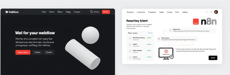
Systems over pages: the WeCraft way
WeCraft Studio builds websites as conversion systems — modern design in Webflow, automated follow-up in n8n, and clear visibility into what works.
- Map the journey: Define primary conversion events, then design pages to move visitors through them without detours.
- Design for momentum: Webflow builds that keep the next step in view: sticky CTAs, targeted modules, fast load, and mobile-first flows.
- Automate the follow-up: n8n flows route leads instantly: notify Slack, enrich with Clearbit-type data, qualify, assign owners, create CRM records, and trigger a scheduling link or tailored email — within seconds.
- Measure and improve: Structured events, funnels, and on-page experiments. Kill what doesn’t move the needle. Scale what does.
Imagine this: A visitor reads a case study, clicks “See how this applies to me,” chooses their industry, and books a 20-minute fit call. Behind the scenes, they’re enriched, routed to the right owner, and receive a helpful prep email — all automated. No dead ends. No lag.
A quick audit you can do today
- Open your top three pages. Is there one primary CTA above the fold?
- Remove two links from your nav. Does clarity improve?
- Read your latest blog post. Is there a next step at the end?
- Submit your own form. Do you get instant confirmation, an option to schedule, and a meaningful follow-up within minutes?
- Check your 404 and thank-you pages. Do they route users forward?
When you’re ready
If you’re tired of pouring budget into traffic while leads stall, let’s fix the real issue: dead ends. WeCraft designs for momentum and automates the moments that matter, so your website stops looking busy and starts compounding results.
Insights That Sparkle
Stay inspired with fresh ideas, industry tips, and behind-the-scenes stories. Our blog is where we share trends, knowledge, and a touch of creativity to help you grow, glow, and stay ahead.
%20(1).png)

.png)
.png)
.png)
%20(1).png)