


A beautiful website that doesn't sell is burning your runway
You launched a stunning site. The typography sings, the animations glide, and your brand finally looks like it should. But three months later, the pipeline looks the same. That gap between beauty and business is where runway gets burned.
Great design matters. But a website without a conversion system is brand theater, not a sales engine. If you’re a founder measuring success by compliments instead of qualified demos, you’re financing a museum piece.
Pretty isn’t a strategy
We audit a lot of beautiful websites that quietly underperform. The patterns repeat:
- Vague headlines that say everything and nothing.
- Multiple competing CTAs (\"Learn More,\" \"Explore,\" \"Get Started\")—none of them tied to a clear next step.
- Slow load times from heavy video and oversized images that kill mobile intent.
- Social proof buried below the fold. Pricing and outcomes hidden behind forms. Navigation that invites wandering, not deciding.
Design isn’t the problem. It’s the absence of a decision architecture. Visitors don’t need more motion; they need a path.
What a converting website actually does
A high-performing site guides a buyer from curiosity to commitment with as little friction as possible. The pieces are simple, but they must work together:
- Positioning that makes the right person say, \"This is for me\"—in the first screen.
- One primary action for high intent (Book a demo, Start trial) and one for medium intent (See pricing, Calculator, ROI breakdown).
- Fast pages. Lightweight media. Button-first on mobile.
- Specific proof near CTAs: customer logos, outcome metrics, and short quotes tied to real use cases.
- Forms with the minimum fields required to qualify. Calendar embedded at hand-raise to remove back-and-forth.
- Content mapped to buying stages: overview for scanners, details for evaluators, objections addressed for skeptics.
When this is in place, you stop relying on guesswork and start seeing predictable behavior.
Systems turn visits into pipeline
Conversion isn’t a page—it's a system. The flow should look like this:
1) Track intent. Every click on a pricing toggle, feature tab, or demo button is an event. You can’t optimize what you can’t see.
2) Route leads instantly. Form submission -> n8n -> CRM (HubSpot, Pipedrive) with enrichment (Clearbit or similar), lead scoring, and owner assignment.
3) Respond within minutes. Auto-confirmation, calendar booking, and a Slack alert to the rep. The follow-up speed alone can double close rates.
4) Nurture the not-yet-ready. If someone downloads the ROI sheet but doesn’t book, kick off a short, relevant sequence—not a newsletter dump.
5) Close the loop. Feed outcomes (won/lost, deal size, sales notes) back into your site experiment backlog.
A quick example
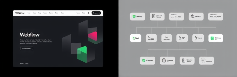
One founder we worked with ran a gorgeous Webflow site that converted at 0.4%. We simplified the headline to speak to a single ICP, removed three secondary CTAs, added outcome-based proof near the primary button, compressed media for speed, embedded Calendly on the demo page, and wired forms to n8n for enrichment, routing, and Slack alerts. Conversion jumped to 1.4% in six weeks. Demo no-shows fell 28%. Sales time wasted on unqualified leads dropped by half. Nothing magical—just systems doing their job.
Metrics that actually matter
Judge your site by leading indicators tied to revenue:
- Conversion rate by traffic source and page
- Qualified lead rate (not just total leads)
- Time-to-first-response
- Demo booked-to-held rate
- Page speed on mobile (real users, not just lab scores)
- Pipeline created and influenced revenue
Instrument this with GA4 or PostHog events, Webflow forms posting to webhooks, and n8n flows into your CRM. You’ll know what to change next—and why.
The WeCraft way
At WeCraft Studio, we build sites as performance systems:
- Strategic design in Webflow: narrative-first pages, crisp interactions, speed by default.
- Conversion architecture: ICP-specific messaging, intent-based CTAs, and decision-focused layouts.
- Data and automation: n8n workflows for enrichment, lead scoring, routing, alerts, and timely follow-up.
- Continuous improvement: experiment roadmaps, A/B tests, heatmaps, and content iterations tied to KPIs.
Beautiful still matters. But beauty that sells is a system—built on clarity, speed, proof, and follow-through. If your site looks the part and still starves the pipeline, it’s not a design problem. It’s an operating problem.
Next step
If a beautiful website isn’t selling, it’s burning your runway. We can help you turn it into a revenue asset. Request a Website-to-Pipeline Audit from WeCraft Studio and see exactly where design, messaging, and automation will move the needle—fast.
Insights That Sparkle
Stay inspired with fresh ideas, industry tips, and behind-the-scenes stories. Our blog is where we share trends, knowledge, and a touch of creativity to help you grow, glow, and stay ahead.
%20(1).png)

.png)
.png)
.png)
%20(1).png)