

Traffic is not conversions — your UX is killing intent.
You’re paying for traffic. Rankings are up. Ads are running. But the pipeline is flat and sales keep saying the leads are cold. You don’t have a traffic problem — you have a conversion problem. And most of it lives in your UX.
Visitors arrive with intent: evaluate, compare, or talk to someone. When your site is beautiful but unclear, slow, or full of dead ends, that intent evaporates. Every extra click, clever line, or generic form is a tax on momentum.
Why a beautiful website without a conversion system fails
Design matters. It sets trust and tone. But aesthetics without structure is theater. Common patterns we see:
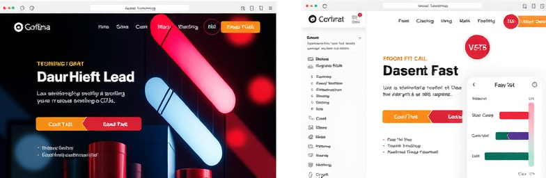
- Looks premium, says nothing — A striking hero with abstract copy and two equal CTAs. If visitors can’t answer ‘What is this, who is it for, what happens next?’ in five seconds, they leave or bookmark and forget.
- Dead-end CTAs — ‘Get a quote’ opens a long generic form with no context, no timeline, no calendar. No one knows what happens after submit, so they bounce.
- One-size-fits-none navigation — Researchers and ready-to-buy users see the same path. Without clear routes for different intents, qualified buyers wander.
- No proof where doubt lives — CTAs sit alone without case snippets, outcomes, or logos. Visitors are asked to believe without evidence.
- Slow and noisy — Pop-ups, carousels, 4MB hero videos. On mobile, this is conversion quicksand.
Aesthetics vs. performance
A performance site doesn’t just look good; it clarifies, guides, measures, and closes the loop. That’s the difference between ‘nice site’ and ‘steady pipeline.’
What makes a website actually convert
- Intent mapping — Identify the top three jobs to be done (validate fit, compare options, talk to an expert). Build a direct path for each.
- Message hierarchy — In the first viewport: what it is, who it’s for, why it’s better, and the next step. Plain language beats cleverness.
- One primary action — A single, consistent CTA per page. Microcopy sets expectations: ‘Book a 20‑min fit call’ beats ‘Contact us.’ Keep it sticky and obvious on mobile.
- Proof at decision points — Place outcomes, testimonials, and recognizable clients next to CTAs. Answer objections where they occur, not on a separate page.
- Respectful forms — Ask only what you use. Progressive steps, autofill, and clear ‘what happens next.’ Offer an instant calendar option for high-intent users.
- Speed and accessibility — Fast loads, readable contrast, keyboard-friendly, thumb-friendly. Performance is part of persuasion.
- Instrumentation — Track micro-conversions: scroll depth, CTA clicks, form errors, drop-offs. If you can’t see friction, you can’t remove it.
- Post-submit automation — Route, qualify, and respond instantly. A warm, timely follow-up converts more than any headline tweak.
The WeCraft way
WeCraft Studio builds modern Webflow websites and automations that respect intent and remove friction. Our approach:
- Discovery — We map visitor intents, audit messaging and flows, and quantify friction across devices.
- Conversion architecture — Clear information hierarchy, decisive CTAs, proof embedded at critical moments, and purposeful navigation.
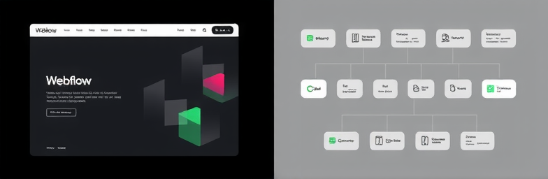
- Webflow build — Fast, maintainable components, CMS for scalable content, and accessibility baked in.
- Measurement — Clean analytics, event tracking, and dashboards that tie activity to pipeline stages — not just vanity metrics.
- Automation with n8n — Lead enrichment, scoring, and routing to CRM and Slack; instant confirmations; calendar booking; follow-ups if meetings aren’t scheduled; tidy handoffs to ops so nothing slips.
- Iteration — We test hypotheses with real data and keep optimizing. No set-and-forget.
The impact: fewer clicks to value, faster responses, and a cleaner, more predictable pipeline. Your website stops being a glossy brochure and starts acting like a reliable acquisition system.
Quick diagnostics you can run today
- Five-second test — Can a new visitor state what you do, for whom, and the next step?
- CTA consistency — Is there one obvious primary action on every page that advances intent?
- Form friction — How many fields are essential? Do you show what happens after submit?
- Mobile path — Can a visitor complete the key action with one thumb in under 30 seconds?
- Response speed — Does someone get notified with context and reply within minutes, not hours?
If the answer to any of these is no, you’re paying for attention you’re not equipped to convert. WeCraft pairs modern design with smart automation so your best prospects don’t slip away at the final inch.
Ready to turn traffic into pipeline? Let’s build the system that earns the click — and the conversation.
Insights That Sparkle
Stay inspired with fresh ideas, industry tips, and behind-the-scenes stories. Our blog is where we share trends, knowledge, and a touch of creativity to help you grow, glow, and stay ahead.
%20(1).png)

.png)
.png)
.png)
%20(1).png)