


Stop tweaking buttons — fix the journey that actually converts.
If you’re a founder, you’ve likely spent a late night debating button colors while leads quietly leak out the side. Here’s the truth: color, microcopy, and drop shadows can lift clicks, but they won’t save a broken journey. Conversion is a system, not a shade of green.
Pretty isn’t performance
A beautiful website without a clear conversion system is an expensive brochure. It feels modern, it loads fast, it photographs well — and it still underperforms. Why? Because visitors don’t buy pixels; they buy outcomes, clarity, and confidence in the next step.
Common symptoms we see:
- High traffic, low pipeline: Ads and SEO deliver visitors, but few qualify or book.
- Random CTAs: “Learn more,” “Contact,” and “Book” fight each other. No obvious path.
- Generic messaging: Everyone is potentially a customer, so no one feels spoken to.
- Forms that repel: Ten fields, no value exchange, and no calendar to lock the meeting.
- No follow-up system: Submissions vanish into inboxes; replies lag; interest cools.
Design matters. But design that converts is less about gradients and more about choreography — guiding the right person to the right action at the right moment, then automating what happens next.
What actually moves the needle
Conversion is a chain. Strengthen each link:
- Clarity first: Lead with a sharp promise to a specific ICP. Name the pain and the measurable outcome. Ditch the slogans; say what improves and by how much.
- Intent-based paths: Build for different entry intents — ready to buy, comparing, or just curious. Provide distinct routes with tailored CTAs (Demo, Pricing, Use Cases, Technical Docs).
- One next best step: Every page should make the immediate action obvious and consistent. If it’s “Book a consult,” reinforce it across hero, mid-page, and footer.
- Proof near objections: Case studies, metrics, and short quotes placed where doubts arise — near pricing, integrations, compliance, or migration content.
- Forms that qualify (without killing momentum): Use 3–5 fields, progressive disclosure, and embed scheduling to remove back-and-forth. Auto-validate business emails and prefill when possible.
- Speed and focus: Fast pages, minimal distractions, and clear hierarchy. Headlines that anchor, subheads that reduce risk, and scannable sections that respect time.
- Instrumentation: Define conversion events, set up funnels, and track by segment. Know which pages create meetings and which ones leak attention.
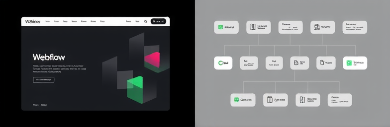
- Automation that closes the loop: When a lead submits, n8n enriches the record, routes to the right owner, posts to Slack, scores by fit, and triggers a tailored follow-up. No manual ping-pong. No missed windows.
A quick example
A B2B services founder came to us with a polished site and flat pipeline. Traffic was fine, but demo-to-meeting rates were low and handoffs were manual.
We re-mapped the journey: clarified the offer in the hero, split paths for Startups vs. Mid-Market, embedded a multi-step form with instant calendar, and placed short proof points near pricing and integration FAQs. Under the hood, we wired n8n to enrich leads, route by segment, trigger personalized emails, and alert the team if nobody engaged within 15 minutes.
Traffic didn’t change. Meetings did. Demo requests rose, more of them were qualified, and ops time dropped because follow-up and routing were automatic. That’s the difference between “new buttons” and a new system.
The WeCraft way
WeCraft Studio builds better systems — online and operationally. Our approach:
- Diagnose: Map your buyer journey, find friction, define success metrics.
- Design for decisions: A modern, high-performing Webflow site built around intent, clarity, and proof.
- Automate the backend: n8n workflows that qualify, route, notify, and nurture — reliably and fast.
- Measure and iterate: Instrument events, review funnels, and tune content, CTAs, and ops together.
This is not cosmetic. It’s the operating system for your growth — the line between “looks good” and “books business.”
Stop tweaking — start orchestrating
If your site feels busy but your pipeline feels light, the problem isn’t your button. It’s the journey. Build clarity, guide intent, automate the follow-through, and measure what matters. That’s how modern design and smart automation translate into tangible business impact.
When you’re ready, WeCraft Studio will help you replace guesswork with a conversion system — Webflow up front, n8n in the back, and a cleaner, faster path from visit to revenue.
Insights That Sparkle
Stay inspired with fresh ideas, industry tips, and behind-the-scenes stories. Our blog is where we share trends, knowledge, and a touch of creativity to help you grow, glow, and stay ahead.
%20(1).png)

.png)
.png)
.png)
%20(1).png)