


What nobody tells you about redesign ROI on founder time
If you’re a founder, your most expensive resource isn’t ad spend or software. It’s your time. That’s why a “beautiful” redesign can still be a bad investment: it eats hours instead of giving them back. The real ROI of a website isn’t how it looks on a moodboard; it’s how predictably it moves the right people from interest to action while keeping you out of the weeds.
The pretty-site trap
We see it weekly: a glossy relaunch with crisp typography and a cinematic hero. Traffic ticks up, compliments roll in, pipeline doesn’t budge. Why? Because the site was designed like a brochure, not a system. No clear job-to-be-done. Generic “Contact us” forms that invite tire-kickers. No qualification, no routing, no follow-up. You end up fielding random inquiries, manually triaging, and explaining the same basics in back-to-back calls. It’s beautiful—but it’s blind.
Aesthetics vs. performance
Design matters. Good visuals build trust and reduce cognitive load. But aesthetics are the packaging; performance is the machine. Performance looks like this: the right prospect understands your offer in 5 seconds, finds the next step in 1 click, sees relevant proof where doubt would appear, and is either qualified and scheduled—or politely filtered out—without you lifting a finger. That is a system, not a paint job.
What actually drives conversion
- Clarity above the fold: who you help, the business outcome, and the time-to-value. Not poetry—precision.
- Guided paths by intent: “See pricing”, “Calculate ROI”, “Book a fit call”. Different prospects, different doors.
- Proof at the point of hesitation: case study snippets, metrics, logos, objections answered where they arise.
- Speed and accessibility: aim for sub‑1.5s load on core pages. Slow pages kill intent.
- Qualified forms: timeline, budget range, use case. Disqualify early. Respect everyone’s time—especially yours.
- Automation: form submission → lead scoring → CRM enrichment → calendar booking → Slack alert → email sequence. No manual glue.
- Content for high-intent moments: pricing, process, FAQs, implementation details. These close gaps your sales call shouldn’t.
- Instrumentation: track events like “CTA click”, “Calendar booked”, “Proposal viewed”. If you can’t measure the funnel, you can’t improve it.
Founder time is the KPI you’re missing
Here’s a common before/after. Before: 40 inquiries/month, ~50% unqualified. You spend ~8 hours/week triaging inbox, rescheduling calls, and sending follow-ups. Result: 3 good fits/month. After rework: 28 inquiries/month, ~80% qualified. A self-serve scheduler tied to your calendar, auto-routing in n8n, and a short disqualifier path for misfit leads. Time spent drops to ~1 hour/week. Result: 7 good fits/month and a cleaner pipeline. The site generated fewer inquiries and more revenue—while giving you back ~28 hours/month. That’s redesign ROI in founder time.
Systems beat screens
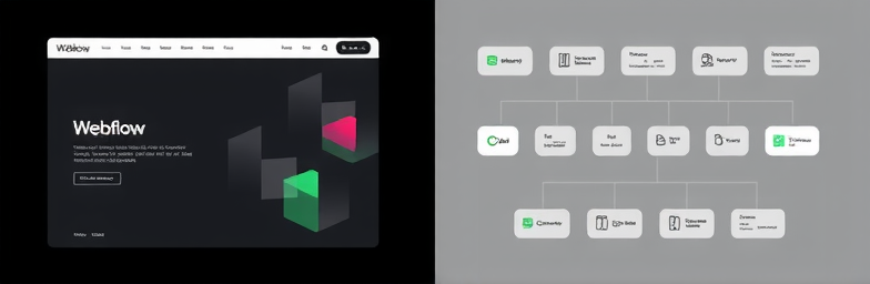
At WeCraft Studio, we pair modern Webflow builds with n8n automations so your site acts like a silent SDR and ops assistant. Example implementation: a prospect chooses a path (e.g., “Redesign + automation”), the form captures timeline and budget, n8n enriches the lead (domain, headcount), scores it, and if qualified, sends a tailored email with a case study and a scheduler for the right team member. If not, it shares a self-serve resource library and a light nurture. Sales sees everything in Slack and your CRM instantly. No bottlenecks. No “Hey, did anyone reply to this?”
A quick 5‑minute audit
- Can a stranger state your value prop in one sentence after 5 seconds?
- Do you offer at least two CTAs for different intents (learn vs. buy)?
- Are leads scored and routed automatically within 2 minutes of form submit?
- Are you tracking bookings, proposal views, and won deals—not just pageviews?
- How many unqualified calls did you take last month? What would it save to halve that?
- Are case studies placed where objections normally appear, not on an island page?
- Core pages load under 1.5s on mobile?
The WeCraft way
We design for sentiment and for systems. Yes, the site will look premium. But more importantly, it will make decisions for you: who gets fast-tracked, who gets nurtured, who gets a polite no. Webflow gives you speed and control; n8n ties the operations together. The outcome is simple: fewer manual loops, tighter conversion, and hours back to think, hire, build, or rest.
If your last redesign made your calendar heavier but your pipeline lighter, it wasn’t a redesign—it was a repaint. When you’re ready for a website that sells while you sleep and protects your time while you work, build the system, not just the screen.
Insights That Sparkle
Stay inspired with fresh ideas, industry tips, and behind-the-scenes stories. Our blog is where we share trends, knowledge, and a touch of creativity to help you grow, glow, and stay ahead.
%20(1).png)

.png)
.png)
.png)
%20(1).png)