


Your website looks modern — but it bleeds leads every day.
Your site looks the part. Clean layout. Confident typography. A tasteful gradient. Yet your inbox is quiet and your pipeline is thin. It’s not because the design is bad. It’s because “nice” isn’t a KPI. Conversion is a system — and most modern websites don’t have one.
Why beautiful sites still fail
Founders tell us a familiar story: traffic is up, demos aren’t. That gap is rarely about color palettes. It’s about friction, clarity, and follow-through.
- No narrative for the right buyer: It reads like a brochure, not a solution. If your headline could sit on any competitor’s site, it won’t convert.
- Split attention: Three CTAs in the hero (“Learn more,” “Contact,” “Try now”). When everything is important, nothing is.
- Trust shows up too late: Social proof is buried. The moment a visitor considers action, they still don’t feel safe.
- Mobile gets second-class treatment: Thumb-stretch menus, crowded forms, and sticky elements that hide the CTA.
- Forms create drag: Seven mandatory fields to “book a call.” Fewer qualified prospects will bother.
- No measurement, no improvement: Events aren’t tracked. You don’t know what pages persuade or where people drop.
Aesthetics vs. performance
Aesthetic design makes you look modern. Performance design makes you money. The difference is intention. A performing page clarifies who it’s for, what it changes, and the one next step — then removes every obstacle to taking it.
Example: a hero section that used to say “A new way to manage operations” becomes “Cut manual ops by 40% with automation your team actually uses.” One primary CTA: “Book a 20‑min audit.” Secondary action (for skeptics): “See how it works.” Navigation trimmed to the essentials. Proof (logos, short wins) placed within scrolling distance of the decision.
What actually makes a website convert
- Message-market fit above the fold: Name the audience and the outcome in one sentence. No guessing.
- One path per page: A single primary action. Everything else supports or exits, not competes.
- Visible proof: Case snapshots, quantified outcomes, recognizable logos, credible testimonials near each CTA.
- Speed and certainty: Fast load, clear pricing signals (even ranges), and a frictionless booking or inquiry flow.
- Right-sized capture: Ask for the minimum to continue the conversation. Enrich the rest automatically.
- Intent-specific landing pages: Don’t send paid or partner traffic to your homepage. Align pages to the promise that got the click.
- Measurement that matters: Track views → scroll → CTA clicks → form starts → submissions → booked calls → won deals. If you can’t see the chain, you can’t fix the link.
The business math founders care about
Say you get 5,000 visits a month. At 0.6% conversion, that’s 30 inquiries. At 2.4%, it’s 120. That’s 90 more leads without buying a single click. Even if 5% of those become customers at $8k average value, that’s ~$36k in additional monthly revenue. Design doesn’t do that alone. Systems do.
The WeCraft way
- Diagnosis before pixels: We audit messaging, funnel paths, and analytics. We find the leaks (and the fastest fixes) before we redesign.
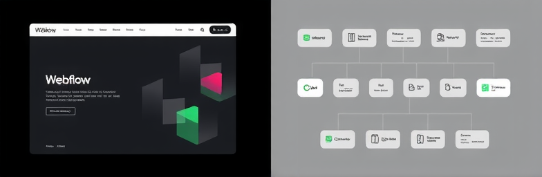
- Performance-first Webflow builds: Clean structure, fast pages, and components you can actually own. One action per page, proof where it matters, and mobile that converts.
- Instrumentation and clarity: GA4 or privacy-first analytics, event tracking, funnels, and dashboards so you know what works this week — not last quarter.
- Automation with n8n: Lead enrichment, routing, and alerts to Slack/CRM in real time. Dead-simple follow-ups, scored and sequenced. No more “lost” form submissions.
- Continuous improvement: Ship, measure, iterate. A/B tests on headlines and CTAs, heatmaps to spot friction, and a backlog that stays tied to revenue.
A quick 5-minute self-audit
- Can a first-time visitor tell who you serve and what changes in one sentence?
- Is there one obvious primary action on the page?
- Is proof (logos/outcomes) visible before the first form?
- Can someone book time or request a quote in under three clicks on mobile?
- Do you track form starts, not just submissions — and what happens after submit?
If you hesitated on any of these, your site is likely bleeding leads. WeCraft Studio builds modern websites that perform — and the automations that make every lead count. We’ll find the leaks, redesign the path in Webflow, and wire n8n to capture, qualify, and route opportunities automatically.
Want to see where you’re losing people? Ask us for a 30‑minute Conversion Leak Audit. No fluff. Just clear next steps and measurable impact.
Insights That Sparkle
Stay inspired with fresh ideas, industry tips, and behind-the-scenes stories. Our blog is where we share trends, knowledge, and a touch of creativity to help you grow, glow, and stay ahead.
%20(1).png)

.png)
.png)
.png)
%20(1).png)